Most
CLIENT:
Barbershop
SERVICES:
Logo design
YEAR:
2023
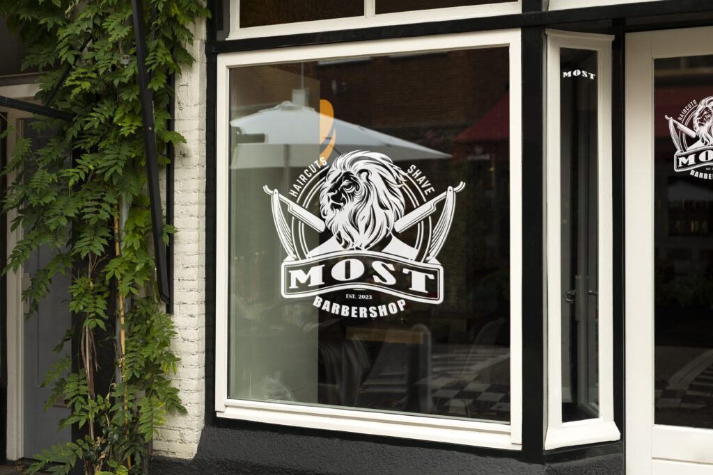
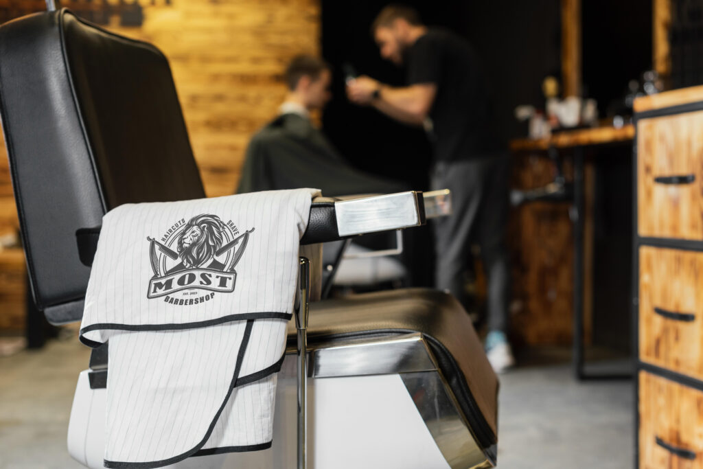
The design project for the barbershop “Most” (client from Poland, the word “Most” translates from Polish as “bridge”) is a real masterpiece, which combining classic elegance and top-tier sophistication. This project was developed with love and professionalism to reflect the unique style and ambiance of the barbershop.

Selection of the name became the first step in the design process. The word “Most” (meaning “bridge” in Polish) was chosen as a symbol of the connection between past and present, as well as between men’s striving to look stylish and well-groome.
At next, color palette, including black, gold, and white colors, was chosen. These colors were selected to emphasize luxury and elegance of the barbershop.

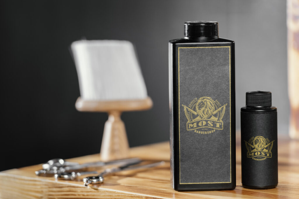
Then was chosen an image of a lion with a luxurious mane as the basis for the logo. The lion was selected as symbol of strength, courage, and elegance. The lion’s lush mane symbolizes care and style.
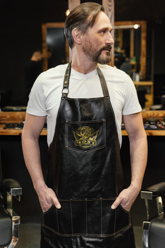
After this, the logo itself was designed. The lion was depicted in black to emphasizing its strength and bravery. For the lion’s mane, as well as the name “Most”, was used gold colour to emphasized the barbershop’s luxury and premium nature. White color was used to convey freshness and purity.
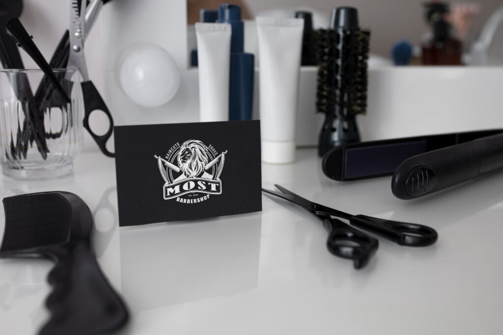
As the result, the design project for the barbershop “Most” became a perfect blend of elegance, luxury, and masculinity. The logo with the lion and its lavish mane became a symbol of style and grooming witch attracts men from all over the world.
